Code
import pandas as pd
df_telematics = pd.read_csv('data/Driver_Behavior.csv')
df_telematics_analysis = df_telematics.drop(columns=['behavior_label'])Can we recognise driving behaviors — safe, aggressive, distracted — from raw sensor data alone, without ever seeing a label? This notebook finds out, using PCA to compress the sensor streams and K-Means to discover the groups.
It was synthetically generated, taken from kaggle vehicle telemetry for driver behavior. Originally the dataset has a target label, but we are going to remove it and explore the data without those labels. The idea is to see if we can identify and classify drivers behaviors based on their telemetry data.
import pandas as pd
df_telematics = pd.read_csv('data/Driver_Behavior.csv')
df_telematics_analysis = df_telematics.drop(columns=['behavior_label'])print(f"duplicated rows: {df_telematics_analysis.duplicated().sum()}")
df_telematics_analysis.info()duplicated rows: 0
<class 'pandas.DataFrame'>
RangeIndex: 30000 entries, 0 to 29999
Data columns (total 10 columns):
# Column Non-Null Count Dtype
--- ------ -------------- -----
0 speed_kmph 30000 non-null float64
1 accel_x 30000 non-null float64
2 accel_y 30000 non-null float64
3 brake_pressure 30000 non-null float64
4 steering_angle 30000 non-null float64
5 throttle 30000 non-null float64
6 lane_deviation 30000 non-null float64
7 phone_usage 30000 non-null int64
8 headway_distance 30000 non-null float64
9 reaction_time 30000 non-null float64
dtypes: float64(9), int64(1)
memory usage: 2.3 MBNo duplicated values and everything is numeric, a good scenario for a PCA
Before compressing anything, we look at how the sensors relate to each other — the correlation blocks below are exactly what PCA will exploit.
import seaborn as sns
import matplotlib.pyplot as plt

plt.figure(figsize=(10, 8))
corr = df_telematics_analysis[[
    "throttle",
    "brake_pressure",
    "accel_x",
    "speed_kmph",
    "accel_y",
    "steering_angle",
    "headway_distance",
    "lane_deviation",
    "reaction_time",
    "phone_usage",

]].corr()

sns.heatmap(corr, annot=True, cmap='coolwarm', fmt=".2f")
plt.title("Correlation Matrix")
plt.show()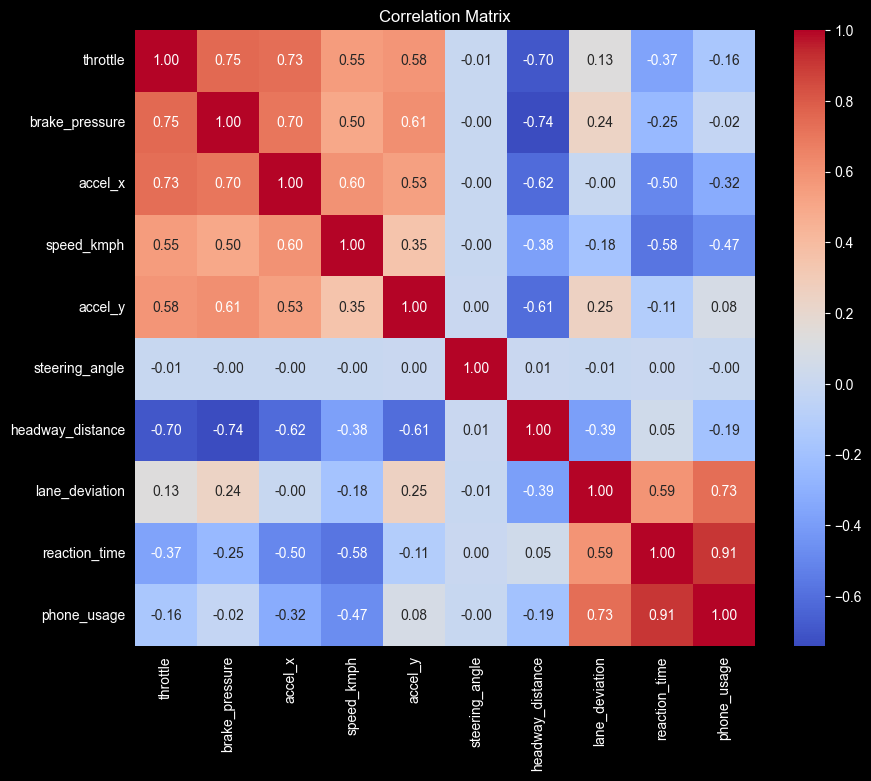
The steering_angle is truly independent, all correlations are very close to \(0\).
Correlation between phone_usage and reaction_time is very high at \(0.91\), suggest that the if the driver is on their phone, their reaction time will be slow, and if the reaction time is slow, it’s very likely that the driver was on their phone.
aggression_vars = [
    'throttle',
    'brake_pressure',
    'accel_x',
    'speed_kmph',
    'accel_y',
]

aggression_corr = df_telematics[aggression_vars].corr()

plt.figure(figsize=(6, 5))
sns.heatmap(
    aggression_corr,
    annot=True,
    cmap='Reds',
    fmt=".2f",
    linewidths=0.5
)
plt.title("Correlation: The Aggression Box")
plt.show()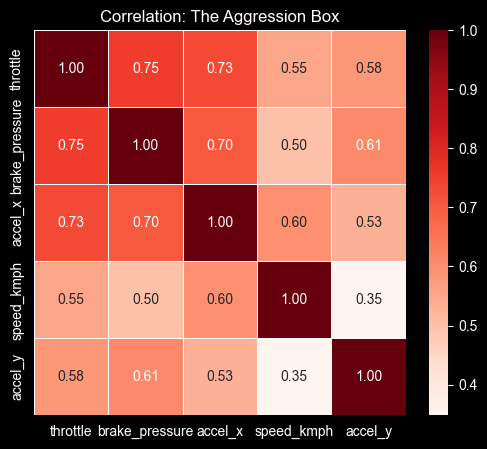
Looking at the correlation of accel_x, brake_pressure and throttle we can infer that aggressive drivers press the gas and jump straight to smashing the brake pedal without “coasting.” This seems like a classic signature of “tailgating,” or speeding up to something, then panic braking.
The speed_kmph has a lower correlation, indicating that the aggression behavior is more about force, because probably we can find aggresive behavior not at high speeds.
The difference on the correlation values between accel_x and accel_y with the other variables, tell us that the aggresive behavior is likely to happen in a straight line reckless driving rather than a drift king cornering behavior.
We standardize the features and let PCA find the directions of maximum variance. The scree plot tells us how many components are worth keeping.
from statsmodels.multivariate.pca import PCA

pca_sm = PCA(df_telematics_analysis, standardize=True)pca_sm.plot_scree(log_scale=False)
plt.title("Elbow Method for PCA")
plt.show()
print(pca_sm.rsquare[pca_sm.rsquare < 0.9])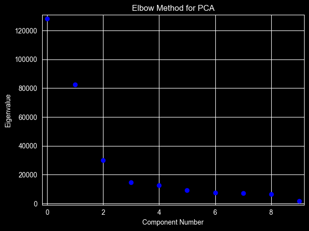
ncomp
0    0.000000
1    0.427785
2    0.703020
3    0.803028
4    0.851606
5    0.893346
Name: rsquare, dtype: float64
The elbow method suggests two components explain 70% of the variance, and three components explain 80%.
I think that three components are more adequate.
pca_3 = PCA(df_telematics_analysis, standardize=True, ncomp=3)plt.figure(figsize=(10, 6))
sns.heatmap(pca_3.loadings, annot=True, cmap='coolwarm', center=0)
plt.title("What does each component represent?")
plt.ylabel("Original Features")
plt.xlabel("Principal Components")
plt.show()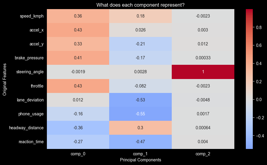
import plotly.io as pio
pio.renderers.default = "notebook_connected"
import plotly.express as px

df_vis = pca_3.factors.copy()
df_vis.columns = ['Aggression (PC1)', 'Distraction (PC2)', 'Steering (PC3)']

df_vis['Speed'] = df_telematics_analysis['speed_kmph']
df_vis['Phone'] = df_telematics_analysis['phone_usage']
df_vis['Brake'] = df_telematics_analysis['brake_pressure']

fig = px.scatter_3d(
    df_vis,
    x='Aggression (PC1)',
    y='Distraction (PC2)',
    z='Steering (PC3)',
    color='Aggression (PC1)',
    color_continuous_scale='Viridis',
    opacity=0.7,
    hover_data=['Speed', 'Phone', 'Brake'],
    title="3D Driver Behavior Analysis"
)

fig.update_traces(marker=dict(size=3))
from pathlib import Path

out = Path("charts/interactive scatter.html")
fig.write_html(out, include_plotlyjs="cdn")
fig.show()import plotly.express as px
df_vis = df_telematics_analysis.copy()
df_vis['Aggression'] = pca_3.factors.iloc[:, 0]
df_vis['Distraction'] = pca_3.factors.iloc[:, 1]
fig = px.parallel_coordinates(
df_vis,
dimensions=['speed_kmph', 'brake_pressure', 'phone_usage', 'Aggression', 'Distraction'],
color="Aggression",
color_continuous_scale=px.colors.diverging.Tealrose,
title="How Raw Driving Data Flows into PCA Scores"
)
out = Path("charts/interactive flow chart.html")
fig.write_html(out, include_plotlyjs="cdn")
fig.show()with three components we can see a separation between those three. ### PC1 — aggression highs: - throttle - brake_pressure - accel_x lows: - headway_distance ### PC2 — distraction highs: - lane_deviation - phone_usage - reaction_time ### PC3 — steering geometry lows: - steering_angle
Why does the PC3 have the lowest steering_angle value?
pca_3_values = pca_3.factors.iloc[:, 2]
plt.scatter(df_telematics_analysis['steering_angle'], pca_3_values, alpha=0.6, color='blue')
plt.xlabel('steering_angle')
plt.ylabel('PC3')
plt.title('PCA of steering_angle vs PC3')
plt.show()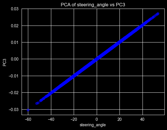
The fact that we have a perfect line in the relationship between the steering_angle and the PC3, means that this is the only behavior that can be grouped on this component.
We assume that steering doesn’t define anything on the other two Principal Components, it could not be grouped on those components.
plt.scatter(
    pca_3.factors.iloc[:, 0],
    pca_3.factors.iloc[:, 1],
    alpha=0.5,
    color='blue'
)
plt.xlabel("PC1 (Aggressive)")
plt.ylabel("PC2 (Distracted)")
plt.show()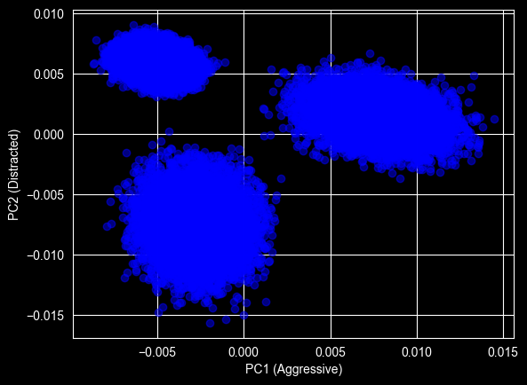
that represents the Aggressive drivers, they have higher values on the PC1. ### Top left — high distraction, low aggression that represents the distracted drivers, they have higher values on the PC2. ### Bottom left — the safe drivers the Safe-Chill behavior, where they don’t have any high value on the PC1 or PC2 components.
importance = (pca_3.loadings ** 2).sum(axis=1).sort_values(ascending=False)

plt.figure(figsize=(10, 5))
importance.plot(kind='bar', color='teal')
plt.title("Which Sensors Drive the Most Variance?")
plt.ylabel("Importance Score (Sum of Squared Loadings)")
plt.show()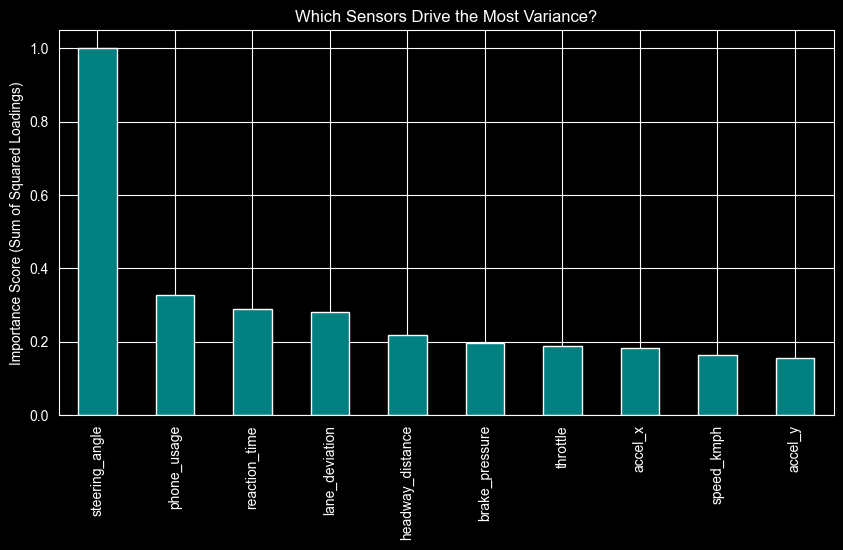
if we can afford only 2 sensors for detecting distracted behavior, we should choose phone_usage and reaction_time. if we repeat the same exercise for detecting aggressive behavior, we should choose brake_pressure and throttle.
We package the whole approach — scaling, PCA, K-Means — into a single scikit-learn pipeline that can label new telematics data end to end.
from sklearn.pipeline import Pipeline
from sklearn.preprocessing import StandardScaler
from sklearn.decomposition import PCA
from sklearn.cluster import KMeans

seed = 42

X = df_telematics.drop(columns=['behavior_label'])
y = df_telematics['behavior_label']

pipeline = Pipeline([
    ('scaler', StandardScaler()),
    ('pca', PCA(n_components=3)),
    ('clusterer', KMeans(n_clusters=3, random_state=seed))
])

pipeline.fit(X)
y_pred_clusters = pipeline.predict(X)from sklearn.metrics import adjusted_rand_score, homogeneity_score
ari_score = adjusted_rand_score(y, y_pred_clusters)
homogeneity = homogeneity_score(y, y_pred_clusters)
print(f"Adjusted Rand Score: {ari_score:.2f}")
print(f"Homogeneity Score: {homogeneity:.2f}")Adjusted Rand Score: 1.00
Homogeneity Score: 1.00We achieved an Adjusted Rand Score of \(1.00\). This indicates a perfect alignment between our unsupervised cluster and the ground truth.
It confirms that the driver behaviors (Safe, Aggressive and Distracted) are linearly separable in the PCA space, and our pipeline can autonomously identify these profiles.
A perfect score deserves a caveat: this dataset is synthetic, and its generator produced cleanly separable behaviors. Real telematics data is far noisier and would not cluster perfectly — what the score validates is the pipeline, not production-readiness.
confusion_df = pd.crosstab(
    y,
    y_pred_clusters,
    rownames=['Actual Label'],
    colnames=['Pipeline Cluster']
)

plt.figure(figsize=(8, 6))
sns.heatmap(confusion_df, annot=True, fmt='d', cmap='Blues')
plt.title("Mapping Unsupervised Clusters to True Labels")
plt.show()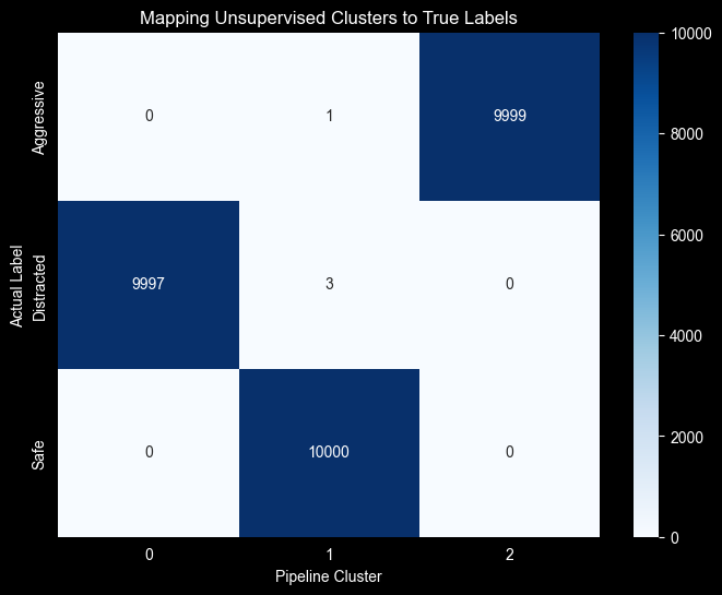
phone_usage + reaction_time capture distraction, and brake_pressure + throttle capture aggression.